B r o k e C u r v e s


Is this a brain scan or what?

How was it done?

Let me do it

Moving on

Credits


W h a t   i t   i s


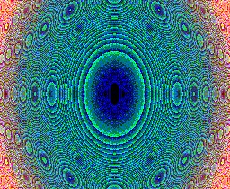
The picture above and those on the previous page are bitmap replicas of an Excel sheet of which the cells have been colored / filled black according to a rule, related to an algebraic equation.

The solutions of an algebraic equation with 2 variables (usually called x and y) can be plotted on paper, with sometimes a nicely shaped curve as the result. The curve represents the points that satisfy the equation. If you change the equation, the curve changes. Consequently, the curve is identified with the equation.

Although these curves can be quite nice (so nice they can be found on the net as 'famous curves') the points in your diagram that don't satisfy the equation are refused; they are denied a share of the fame simply for having a wrong x or y value. Now that's how nice celebrities are!

As you've probably already guessed, I would not bring up the matter if I did not have a proposed solution. In fact I have two. The first solution is to take a point and calculate the constant value to be added to the equation to make that point fit. If that value, rounded to an integer, is odd, don't plot the point. However, if it's even, the point is plotted, no matter by how far it mismatches the true curve. In other words, instead checking on f(x,y)=0, check f(x,y) to be even.

The second solution is to write f1(x,y)=f2(x,y) instead of f(x,y)=0 and calculate f1/f2 for a given x and y.
Again, if its integer value is odd, leave the point out, if it's even, plot the point.
I feel that every point in the diagram now has a fair, that is fifty-fifty chance of making the grade.

The point selection ability of the curve, or even its power to select has been broken.


H o w   i t   i s   d o n e


The traditional method of plotting a curve involves repeatedly picking a value for x, calculating the corresponding value of y and plotting, in your X-Y diagram, a dot with coordinates x and y. This can be automated by defining a range of x and y values (i.e. choosing the diagram size) and values for x- and y-increments, then trying all combinations in the equation, using two nested For ... Next loops. The diagram sheet is divided in squares; each square has a value of x and y assigned to it with which the calculating will be done.
An Excel sheet (providing the squares) assisted by a VBA module (providing the calculation loops) is perfectly suited for the job.
Give the Excel sheet a width of 256 columns (the maximum) to represent an x-range from -5 to +5 and a height of say 210 rows to represent a y-range from -3 to +3 over the rows. The next cell in a row will represent an x-value that is 10/256 = 0.03906 higher than the previous. The next cell in a column will have 6/210 = 1/35 = 0.02857 added to its y-value.

As a first example, we’ll take a circle with radius 2. Its equation is:    x² + y² = 4
The true curve is plotted in red in the upper graph. The red circle also demonstrates breaking method No. 1, if you judge the mismatch to be zero instead of odd/even.
The X- and Y-axis are plotted in blue.
Breaking method No.2 is demonstrated in black, but only 5% adjustments of the right term are shown. Because adjustments can be either up or down, there are two black circles. For, of course, both broken curves are circle curves as well, as the right term represents just the radius.
In the lower graph, the full result is shown, that is where the mismatch (red half) or the right-term adjustment values are even. The odd values remain white.
Famous, yes; nicely shaped, maybe but interesting? No.


As a definite example that is interesting, we’ll take the Cartesian leaf.
Its equation is:   x³ + y³ = 3 a x y
The constant a will be set to a=1 rightaway for simplicity.
In the upper graph, the true curve is again in red, also representing mismatch = 0    
where     mismatch = x³ + y³ - 3 x y
The black curves (upper graph) again represent, let’s call it a misfit, of this time 10%.
In formula, that would be:     misfit = 1 ± 0.1      where      misfit = ( x³ + y³) / ( 3 x y )
The lower graph shows the full result of even values for mismatch (in red) and misfit (in black).
And there it is - the curves themselves are broken!


T h e   a s p e c t   r a t i o   b l u e s


With 256 columns that have their width adjusted to fill the screen area, the number of rows required to also fill the screen area appears to be 210, if the row height is adjusted to make the cells look close to square and the screen is 800x600.
As far as the represented numbers are concerned, the cell dimensions are about 39:29, not square at all.

Yet the circle appears round on the Excelsheet, which is correct by the following reasoning:
The X-axis is row 105, the Y-axis is column 128, you’ll agree. The radius is 2 in value or 2 / 10 * 256 = 51 in columns, as 256 columns represent a value range of 10. The radius is also 2 / 6 * 210 = 70 in rows, as 210 rows represent the range from -3 to +3.
The full screen area is 800x600, but the worksheet window is appr. 770x430 due to toolbars etc. This dimension is in pixels.
One column takes 770 / 256 = 3 pixels, one row takes 430 / 210 = 2 pixels.
So the aspect ratio of the circle is 2:2 in numbers, becomes 51:70 in cols:rows and 153:140 in pixels.

This is close enough to 1 to make the circle look round - on the Excel sheet.
Some additional deformation may occur from your screen if horizontal and vertical pixels scale differently to millimeters or inches.
Note that if your screen is 640x480 or 1024x768, this doesn’t matter: the ratio stays 4:3 as in 800x600. Of course at 640x480 you'll have to scroll (and I removed the horizontal scrollbar to enlarge window height).

The bitmap is a replica of the Excel sheet, not the window, so the circle in the bitmap will have an H:V aspect ratio of 51:70 and be oval. To make it round in the bitmap, the aspect ratio of the number ranges must be changed from 10:6 = 1.667 to 1.667 * 51 / 70 = 1.214, f.i. by maintaining 6 vertically but shrinking horizontally from 10 to 7.3.
You’re still with me? Good! Then you'll be ready for the following
note:
You could start with real square cells 3:3 pixels and keep it simple, but would need a screen resolution of 1024x768 (or whatever there is beyond 600 lines). The column count must remain 256 and you would have room to spare (grayed) horizontally, but vertically more lines would fit in.
At 800x600 a 3-pixel row height allows you only about 100 rows in the available window and that would lead to a very 'landscaped' bitmap with aspect ratio 210:100.
Excel won't let you choose row height freely, but it does offer 2.5 between 2 and 3. About 136 rows will fit in an 800x600 screen window. That still is too flat for my taste, but after all, if we break 'm, we could as well crush them too. The VBA code for the Excel sheets (that I'll give you in the next section) should give you sufficient ground to try that.

To conclude (800x600 screen):
Round Circle in Excel
ItemAspect RatioDimensions
Excel Window
770 : 430
pixels H:V
Excel Window
256 : 210
col : row
Excel Window
10 : 6
number values
Excel Circle
2 : 2
number values
Excel Circle
51 : 70
col : row
Excel Circle
153 : 140
pixels H:V
Bitmap Circle
51 : 70
pixels H:V
Round Circle in Bitmap
ItemAspect RatioDimensions
Excel Window
770 : 430
pixels H:V
Excel Window
256 : 210
col : row
Excel Window
7.3 : 6
number values
Excel Circle
2 : 2
number values
Excel Circle
70 : 70
col : row
Excel Circle
210 : 140
pixels H:V
Bitmap Circle
70 : 70
pixels H:V

F o l l o w   m e

Here's how to set up an Excel workbook to generate your own B&W bitmaps. You could easily do this on-line.
    Read and memorize the second item (what to do after Excel is 'on') before following the first.
  1. Start Excel now; make sure there are 2 worksheets called 'Sheet1' and 'Sheet2' (Excel default is to have three).
  2. (Re)select this page from the taskbar (that's the bar down in the screen, next to Window's 'Start' button).
  3. From this page , click Edit - Select All, then copy (Ctrl+C) all, then close it's window.
  4. Switch to Excel again (read ahead before or switch occasionally between Excel and this page).
  5. Open the Visual Basic editor in one of the three following ways:
  6. From the VB toolbar, not the Excel toolbar, choose Insert - Module.
  7. Paste (Ctrl+V) what you've copied in step 3 (in the right blank window, the cursor is already there).
  8. Close the VB Editor - if you're asked to save, you've tried to close Excel. Redo correctly.
    You now have created 4 macros: 'acirkelrs', make_bitmap', 'title_off' and 'title_on'.
  9. Run the macro 'acirkelrs' (top in the list) in one of the three following ways:
  10. At the prompt, type a curve no. (assume you'll choose no. 1 - the Cartesian Leaf) and watch the worksheet cells fill.
  11. At the next prompt, accept the proposed filename or devise your own. (Or cancel, if the result is not worth saving.)
    Proposal = Curve no. + 'curve' + Month no. + Day no. + 'A'.
    A further run the same day, the same curve will proposedly be called '...B'.
  12. Save the workbook, giving it an appropriate name such as 'cirkelrs'.
    You could now redo the procedure from step 9, but maybe it's more convenient to do it later; you're still online.
Welcome back. Glad you made it and... congratulations!
The bitmaps you have made can be viewed from the newly created map C:/bitmaps/.
. . a n m o v i n o n

Go back to Excel and read the macros and the comments therein. For instance, you could change the location of the bitmaps to something else than C:/bitmaps/. By clicking the title box in the Excel sheet, it goes away. If a curve is 'unavailable', redo Alt-F8 Enter. Try changing the formulae themselves.
Further, you'll see that the various parameters are read from Sheet2, column B, unless empty. So: experiment by selecting different curves or closer x- and y values to 'zoom in' on a certain interesting area.
Alternatively, be curious and expand the map by 'zooming out'. If you select larger screen steps, the sheet fills more rapidly.
Just try it all! You'll have your own bitmap library in no time.
Copy the parameters of your best designs to columns C, D etc. of Sheet2, for later reference.

Click here to have a preview of what can be done in colour (loading might take a few minutes...).
Click here for a continuation about colour bitmaps.

C r e d i t s

Just search for 'famous curves'. My crop at the time was:

Checked and found alive, October 2001:Dead now, maybe shielded:Reappeared: